|
|
| GIS Cookbook: Recipe - Making a Choropleth Map |
Keywords: Spatial analysis, choropleth map, color symbology
Category: Data Analysis
Software: ArcGIS 8/9.x
Problem: How do I make a choropleth map, so I can see spatial patterns and analyze them?
Description: A choropleth map is a map that uses different colors to show how some phenomenon varies across space. For example, a choropleth map of U.S. states colored according to their population density (with light hues representing states with low population density and dark hues representing states with high population density) makes it easier to identify spatial patterns in the population data.
Scenario:
Ever since the work of John Snow and his mapping of Cholera cases, mapping cases and frequencies of diseases can help to find sources and cures. One of the major research topics of the 20th century is the search for an understanding of cancer. It helps researchers in the subject to know where the cases of cancer are the highest. In this scenario, we are going to look at cancer statistics for each county in the state of New Mexico. Once finished we can look at and analyze the information and compare it to other choropleth maps.
Methodology:
1) Open ArcMap and add the shapefile that covers the desired study area in the desired areal units.
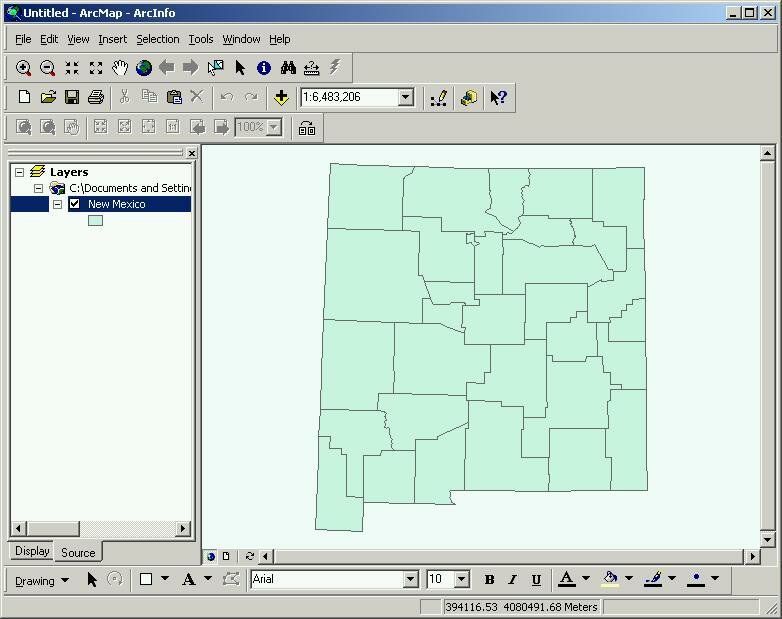 |
Your starting shapefile/layer
|
2) Right-click on the layer/shapefile and select Open Attribute Table . This will display the tabular information currently within the shapefile. Make sure the information you want to see is displayed within the attribute table. If it is not, and you need to add it from an external source, see the recipe Joining a table . Make sure to note the name of the column you are going to display.
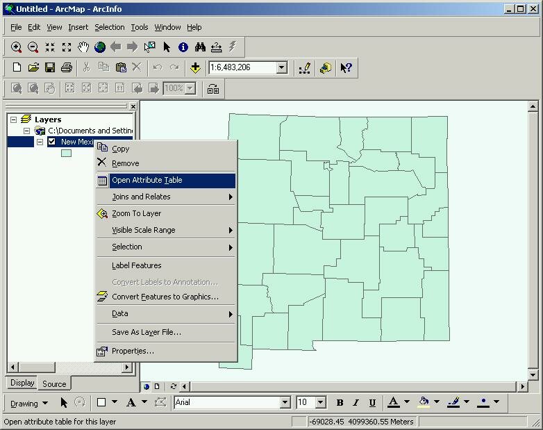 |
Vew attribute table
|
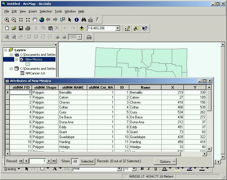 |
Your attribute table
|
3) Right-click on the shapefile and select Properties
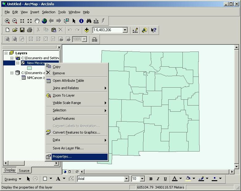 |
Layer properties
|
4) The Layer Properties window will appear. (If you have opened the properties for this shapefile before it will open to whichever properties window you had opened last.)
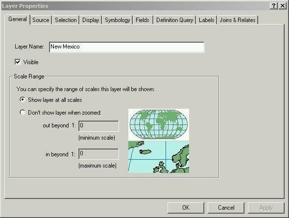 |
Layer Properties opened
|
5) On the top of the window click on the Symbology tab.
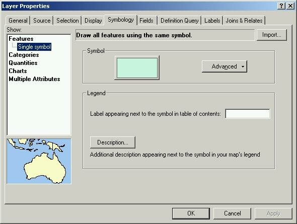 |
Symbology tab
|
6) On the left side of the dialog box under the Show: heading, select Quantities , then Graduated colors.
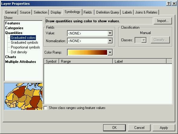 |
Quantities selected
|
7) In the Fields section of the window , find the drop-down list labeled Value: . Select the attribute field from your shapefile that contains the data you wish to use to construct the choropleth map.
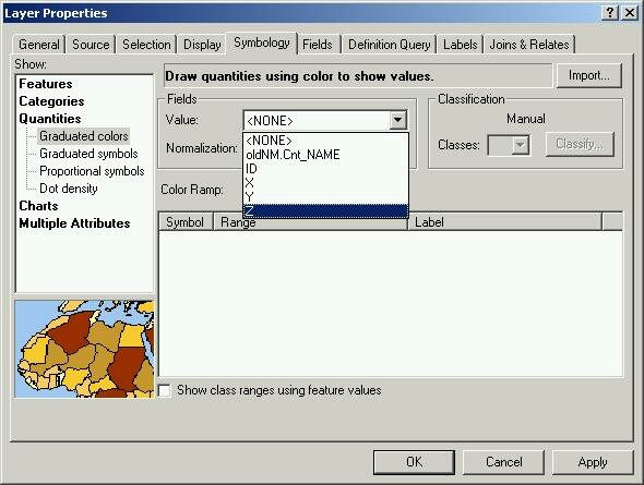 |
Select your attribute
|
8) ArcMap will break your data up into five classes using the default Natural Breaks classification method and will assign a random light-to-dark color ramp.
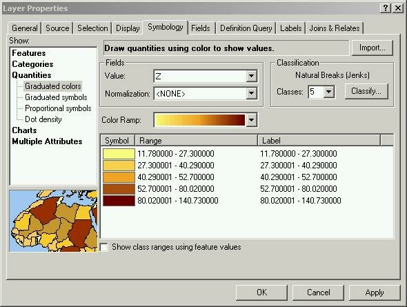 |
What your choropleth classes will look like
|
9) Within the Layer Properties window you can now edit the colors (color ramp), number of classes, class intervals (click the Classify button) and even the type of classification (also accessed through the Classify button).
10) When the settings are tuned to your liking click Apply and then OK
11) Your choropleth map will appear on your map window.
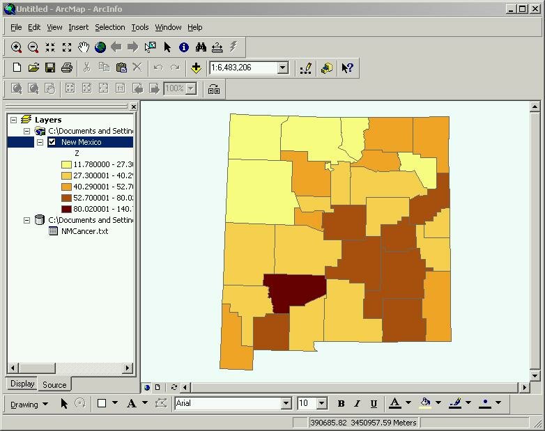 |
| Your choropleth map. Higher cases of cancer are darker, lower are lighter. |
|
| Authored by: Benjamin N. Sprague Modified: 2/4/05 |
|
Copyright © 2002-2015 by Regents of University of California, Santa Barbara
Cookbook: Ben Sprague, Ethan Sundilson, Carlin Wong, Sam Ying
|
|
|